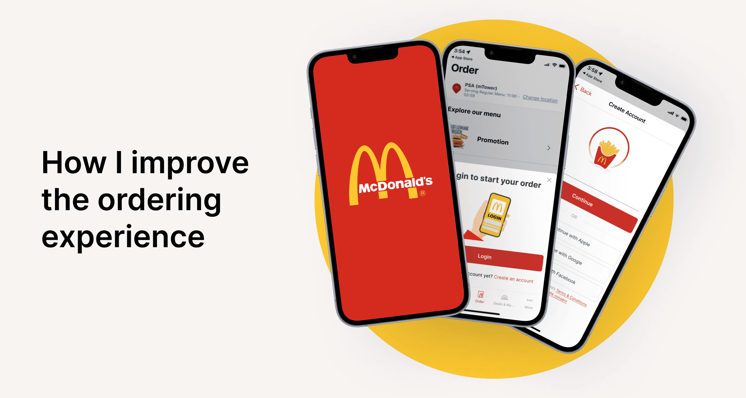
App design: UX improvement
It started with my terrible experience when I was trying to order in Mcdonald’s…
One day, I went to Mcdonald's and I saw this QR code on the table so I decided to sit down and order my meal online.
As a user, my expectation was…
Scan the QR code on the table → Put my order in → Pay → Pick up my order from the counter → Enjoy my meal!
However, here's what I experienced.
How could I (as a designer) improve the experience?
I believe one of the main user goals is to order food. Therefore, with this user goal in mind, I took a stab on improving the product.
01
User Flow
First, I mapped out the ideal user flow to see if there’s any redundant screens or if I should add any new screens for better experience.

02
Hi-fidelity mockup
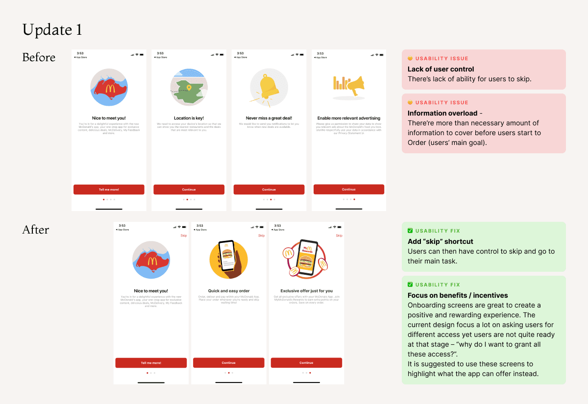
I made twists on the current design to improve the overall user experience.
Here’re 5 key improvements that I made:
Enhance user satisfaction and trust with user control and freedom
Provide clearer user benefits / permission values
Incorporate obvious design to guide users to take certain action
Reduce time on task and use progressive disclosure if needed
Simplify sign up form and improve user control


